CSUN Conference 2010
I’ve just returned back from the 2010 CSUN International Technology & Persons with Disabilities Conference in San Diego. This was the conference’s 25th year, which easily makes it the oldest conference I’ve ever attended or presented at. My colleague Victor Tsaran and I were presenting a talk entitled, The New Yahoo! Homepage: Challenging the Challenge of Accessibility. The entire homepage team has put a lot of work into making the new Yahoo! homepage not just accessible, but also fun to use for everyone. We really wanted to highlight this work in front of the people who would appreciate it the most.
I spent three days in San Diego at the conference, and I can honestly say it was one of the most impactful and transformative experiences I’ve ever had.
Adjusting
The first thing I noticed when arriving at the conference was how uncomfortable I was. I don’t think this is unusual for someone like me, who didn’t grow up around a lot of differently-abled people. I felt incredibly awkward and unsure of how to interact with the people I met. A lot of times, I found myself wanting to offer help but wasn’t sure if doing so would be insulting. I’ve not felt this self-conscious since high school.
It took a little while for me to adjust to the atmosphere. For example, there’s a lot of people bumping into one another. This should come as no surprise with the number of canes, seeing-eye dogs, and wheelchairs that marked the hotel during the conference. At first, this bothered me as I watched every step and tried to duck and dodge as I made my way around. After a while, though, this just became part of the normal flow of things. No one took offense when someone bumped into them; there were no explosions of frustration, just patient understanding. Somehow, it all ended up feeling much more civilized than my everyday life.
Pecan – The seeing Y dog
As part of Yahoo!’s presence at the conference, we setup Pecan, a seeing-eye dog, with a camera that automatically posted photos to Flickr periodically. This allowed everyone to have a dogs-eye view of the conference. There were some great moments, including a lot of upside-down and sideways photos that made us chuckle.
Pecan became a bit of a celebrity at the conference. Some even thought that Pecan represented the next step in mobile accessibility. Really, our “seeing Y” dog was just a fun way to experience the conference.
The CSUN tweetup
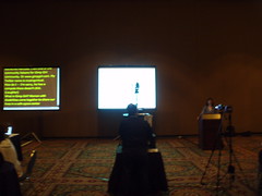
The first night I was at the conference, there was a tweetup where people who’ve conversed over Twitter could meet in person. The setup of the room was interesting. There were two screens, one on the left that had live transcription of the speaker (there was a guy sitting there with what looked like a court stenography device) and the right screen showed the speaker’s presentation. It was fun watching the live transcription as people were talking.
It was at the tweetup that I met Yahoo! UK engineer Artur Ortega for the first time. We’d communicated a lot through corporate email but had never met in person (I was away while he was visiting the Sunnyvale office last year). I also met Jennison Asuncion, an IT accessibility consultant and avid jazz fan. It was great getting to discuss accessibility issues with both at the tweetup.
The most poignant and moving moment of the tweetup came from Molly Holzschlag, who gave a moving talk revealing that she had battled a disability of her own when she was younger. She also brought with her a call to action: let’s stop talking about disabled access and start talking about universal access. In other words, we shouldn’t be designing web interfaces for sets of individual people with individual capabilities, we should be designing web interfaces that everyone can use. I couldn’t agree more, and “universal access” became my new mantra.
Exhibition hall
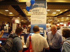
Every day, a large exhibition hall was open to everyone (including the general public) and containing vendors of all kinds of assistive technologies. This wasn’t the typical exhibition hall experience – in some cases, what these vendors have to offer are life-altering products for people who might otherwise have difficulty learning to read, communicating with others, or finding their way around.
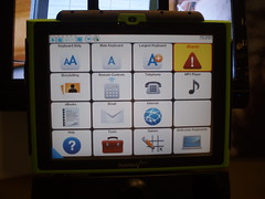
The types of devices I encountered here were incredible. Of course, I know about screen readers and single switches thanks to the Yahoo! Accessibility Lab, but there were so many more devices I’d never even dreamed of. There were personal communicators that made it easy for people who are mute to quickly communicate with others. The basic idea is to have a pad with a number of pictures on it, and tapping a picture quickly announces a word or phrase.
There were a large number of magnification devices for those with low vision. Some were large computer-like structures while others were portable handheld devices. I found myself wandering around the exhibition hall, trying out various devices, and talking to the different vendors about how people use these tools. I learned a lot about the daily lives of differently-abled people and how these devices represent a huge degree of freedom that previously wouldn’t have been possible.
Erik arrives
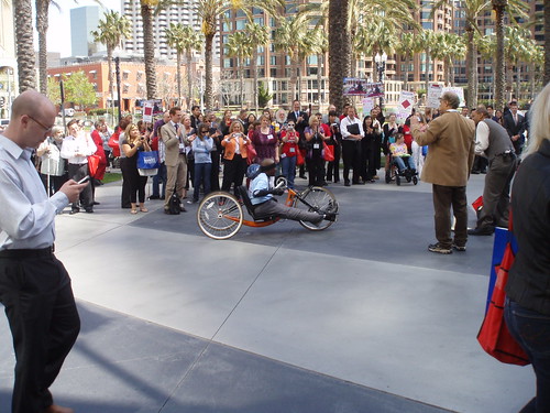
To celebrate the 25th anniversary of the conference, recent CSUN graduate Erik Williams decided to bike 150 miles from the CSUN campus to San Diego. That would be quite a feat for anyone, but Erik also happens to be paralyzed from the waist down. He rode a bike with hand-pedals the entire way and arrived around noon on March 25th, exhausted, but in good spirits. A large crowd gathered to welcome him on the conclusion of his amazing journey.
Our talk
Instead of the usual Powerpoint presentation, Victor and I opted instead to spend most of the session giving live demos of the Yahoo! homepage. I began the talk by explaining to the room how we approached accessibility in the Yahoo! homepage by considering it from the beginning. Accessibility is one of those things that you should be thinking about from the start along with other popular topics such as performance, maintainability, and internationalization. I explained a little bit about our progressive enhancement strategy (though not too much, since there weren’t a lot of web developers in the audience). Victor gave a nice overview of the Yahoo! Accessibility Lab run by himself and Alan Brightman.
Then, we got to the fun stuff. Our general approach was for me to explain a feature of the new Yahoo! homepage and show how I would use it. Then I turned the show over to Victor who would demo the same feature using a screen reader and explain some of the technical solutions we employed to get the desired results. We went through three major areas:
- **Tabs. **Tabs are a very common UI paradigm that relies heavily on visual recognition of the pattern. We used ARIA to markup our tabs with additional semantics so that screen readers can understand the relationship of these elements and interactions.
- Search assistance. When you type a term into the search box, you see a list of search suggestions underneath. We showed how we enhanced this interaction for screen readers by using ARIA live regions to announce when suggestions are available.
- My Favorites. This is the most dynamic part of the homepage, and also, the most useful. We showed how the opening and closing of favorites can be accomplished either with a mouse or keyboard. People were also really impressed with the keyboard-accessible way of rearranging the order of favorites in the list.
We finished the talk by showing the homepage’s Easter egg. I won’t ruin it for people who haven’t yet found it, but it does involve a yodel. Victor first found the Easter egg using his screenreader and I asked the audience to guess where it was visually on the page. A couple of people shouted out the correct location and we heard yodels for the next three minutes as others found the Easter egg on the page. The reaction this was overwhelmingly positive and got a loud ovation and chuckles right then and there.
A lot of people came up to ask us questions after the talk was over, and the spirit was one of overwhelming appreciation. We received a lot of positive feedback throughout the conference on the work the homepage team has done making the cool and fun features of the page accessible to everyone.
Dinner
Perhaps the most powerful of all the experiences I had at the conference was at dinner on Thursday night. I met up with Victor and a fairly large group including Yahoo! Bangalore Accessibility guru Srinivasu Chakravarthula. So there I was, one of 10 people heading out to dinner and one of only three who have what’s considered normal vision. Five were completely blind and two had low vision. We must have been quite the scene as we took the five-minute walk down to the Seaport Village to find a restaurant for dinner.
This was a completely new experience for me. As I helped guide the group down the street, I found myself naturally starting to intermix cues into conversation. “Step down.” “Step up.” “Turning right.” Periodically someone would ask what was around or what various noises were.
Arriving at the restaurant, I quickly realized how different this dinner would be as I asked for a table for 10. The hostess politely asked how many menus we’d like. I paused momentarily before realizing that the menus would only really be useful to a few of us. There were no braille menus at this restaurant, so as I sat down, I wasn’t sure how we’d let everyone know what was available for dinner. Comfortable with my own ignorance, I asked, “so guys, how does this work? Should I just start reading the menu out loud?”
One of my dinnermates calmly explained, “it usually works best if you read us the general groups that are on the menu. If something sounds interesting, we can tell you and you can read what’s in that section.” And so that’s exactly what I did. In my mind, I thought of a breadth-first traversal of a tree (yes, I’m a big geek) as I traveled to each section and dug in only if someone requested. In that way, everyone selected their dinner.
While eating, we all talked a lot about accessibility. I learned a great deal just by listening as people compared the accessibility features of the new smartphones and various web applications. Yes, certain companies are not very popular with this group, and I’m happy to say that Yahoo! was spoken of quite highly. We also spoke of things that could be improved in general and I learned a bit about everyone’s background.
After dinner, the table became enthralled with a simple cardboard device that Artur had brought along. Artur explained to us that notes of different denominations actually have different dimensions in the UK. I hadn’t thought of it before, but since US dollar bills are all the same size, that makes it impossible for blind people to determine the denomination. The UK system suddenly made a lot sense to me. Artur’s cardboard tool had steps that line up with the width of the bank note, so the lowest is 5, the next is 10, etc. Everyone spent time playing with this as it just seemed too logical. The point was really hammered home later when someone asked me if the bills he was holding were fives.
I also looked on curiously as we each were brought out our own individual bills. The slips of paper had no braille, so there was no way for anyone to know the total cost. Since our group was large, the gratuity had already been added, so there was one less thing to worry about. The waitress was kind enough to mention the amount of each person’s bill as she placed it in front.
We walked back to the hotel and some of us split off to grab drinks and continue the conversation. It was truly an eye-opening night for me and an experience I won’t soon forget.
Wrapping up
Talking about accessibility in a vacuum is a good start, but for many web developers, that’s all we ever do. We know that things should be a certain way, and we know the reasons why. What we don’t know is who our users are, the ones who are actually benefiting from all of this work. To be thrust into an environment of these users, the people who go to the Yahoo! homepage to get their news and information using screen readers or other assistive devices, was an incredible experience.
I think that sometimes we web developers get a little bit too wrapped up in the technology and lose our focus on the real goal: to provide for users. The people I met at the CSUN conference are the users we don’t hear from a lot or, in some cases, even think of frequently. Getting to meet real users who are affected by the technical design decisions we make everyday is so vitally important to making us remember that the Internet is about people more than anything else.
Although Victor and I were presenting the accessibility features of the Yahoo! homepage at this conference, it’s much more a tribute to the incredibly talented team I have the honor and privilege of working with each and every day. They are the ones who, from top to bottom, bought into the concept of accessibility from the beginning and never bat an eye when someone requests a fix for accessibility purposes.
I especially need to call out the contributions of the entire front-end engineering team for the homepage. These are the men and women who spend day in and day out tuning the user experience so that everyone can use the homepage in the way in which they prefer. You should all know how proud I am to work with you and how proud I was to present our collective work at this conference.
This is truly an experience that I’m going to look back upon fondly for many years to come. Thanks to Victor and Alan for suggesting that we do this talk. I couldn’t be happier with how it turned out and how much I’ve learned in the process.
Translations: Belorussian.
Disclaimer: Any viewpoints and opinions expressed in this article are those of Nicholas C. Zakas and do not, in any way, reflect those of my employer, my colleagues, Wrox Publishing, O'Reilly Publishing, or anyone else. I speak only for myself, not for them.

