You can’t create a button
One of the most important aspects of accessibility is managing focus and user interaction. By default, all links and form controls can get focus. That allows you to use the tab key to navigate between them and, when one of the elements has focus, activate it by pressing the enter key. This paradigm works amazingly well regardless of the complexity of your web application. As long as a keyboard-only user is able to navigate between links and form controls then it’s possible to navigate the application.
Unfortunately, sometimes web developers try to get a bit too clever in creating their interfaces. What if I want something to look like a link but act like a button? Then you end up seeing a lot of code that looks like this:
<a href="#" onclick="doSomething()">I'm a button</a>
That code should turn your stomach a little bit. It’s a link that goes nowhere and does nothing. All it does is attach an onclick event handler to give it a purpose. Because the desired appearance for this element currently is link-like, the markup uses a link and JavaScript.
Those who are familiar with ARIA may “fix” the problem by using the following:
<a href="#" role="button" onclick="doSomething()">I'm a button</a>
By setting the ARIA role to button, you’re now telling the browser and screen readers that this link should be interpreted as a button (that does an action on the page) rather than a link (that navigates you away). This has the same problem as the previous code except that you’re trying to trick the browser into treating the link as if it were a button. In reality, it would be most appropriate to just use button:
<button onclick="doSomething()">I'm a button</button>
The markup to use should never be based on the appearance of a UI element. Instead, you should try to figure out the real purpose of that element and use the appropriate markup. You can always style button to look like a link or a link to look like a button, but those are purely visual distinctions that don’t change the action.
If these were the worst sins of web applications that I have seen, I would be pretty happy. However, there is another even more disturbing trend that I’m seeing. Some Web applications are actually trying to create their own buttons by mixing and matching different parts of HTML, CSS, and JavaScript. Here’s an example:
<div tabindex="0" role="button" onclick="doSomething()">I'm a button</div>
This is a valiant attempt at creating a button out of a <div>. By setting the tabindex attribute, the developer has assured that keyboard users can navigate to it by using the tab key. The value of 0 adds the elements into the normal tab order so it can receive focus just like any other link or button without affecting the overall tabbing order. The role informs the browser and screen readers that this element should be treated as a button and the onclick describes the behavior of the button.
To anyone using a mouse, assuming the styling is correct, there is no distinction between this element and an actual button. You move the mouse over and click down and an action happens. If you’re using a keyboard, however, there is a subtle but important difference between this and a regular button: almost all browsers will not fire the click event when the element has focus and the enter key is pressed. Internet Explorer, Chrome, Firefox, and Safari all ignore the enter key in this situation (Opera is the only one that fires click).
The enter key fires the click event when used on links and buttons by default. If you try to create your own button, as in the previous example, the enter key has no effect and therefore the user cannot perform that action.
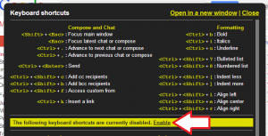
This horrible pattern is found most frequently in Google products. Perhaps the most ironic usage is in Gmail. When you press the ? key, a dialog pops up showing you available keyboard shortcuts and allowing you to enable more advanced shortcuts.
It looks like the word “Enable” is a link, so you press tab a few times to give it focus and press enter. Nothing happens. Why? Because the link is actually neither a linkage nor a button, it’s a <span>. Here’s the actual code:
<span id=":s7.pl" role="link" class="aoy" tabindex="1">Enable</span>
Almost exactly the problematic pattern mentioned earlier in this post. So basically in order to turn on keyboard shortcuts you need to be able to use a mouse. In fact, many of the buttons on Gmail are made in this way. If not for the keyboard shortcuts it would basically be unusable without a mouse.
Gmail isn’t the only Google site that uses this pattern. It can be found throughout the network of Google sites, including Google Groups and Google Analytics (which also hides focus rectangles). This alone makes Google products incredibly challenging to use for sighted users who don’t use pointing devices.
If you expect the user to interact with something, then you need to use either a link or button. These have the correct behaviors both in terms of getting focus and activating when the enter key is pressed. Links should be used whenever the action is a navigation (changes the URL) and buttons should be used for all other actions. You can easily styled these to create the visual effect that you want, but nothing can replace the accessibility of the native links and buttons.
Disclaimer: Any viewpoints and opinions expressed in this article are those of Nicholas C. Zakas and do not, in any way, reflect those of my employer, my colleagues, Wrox Publishing, O'Reilly Publishing, or anyone else. I speak only for myself, not for them.

